Color Camera
Designing a Photo-to-Coloring Experience Through User Research and Child-Centered Design
How do you design a creative experience that children love—and caregivers are willing to introduce?
Overview
Video of the final delivery.
Crayola Color Camera transforms personal photos into printable coloring pages, allowing children to decorate, customize, and bring their own creations to life.
At Crayola, I led product discovery and experience design in partnership with Marketing, Innovation, and Engineering to explore how digital tools could extend the creative value of physical coloring products.
Rather than starting with features, we began by questioning the product direction itself:
Was this a campaign extension—or a reusable creative platform?
Through research and prototyping, the project evolved from a campaign concept into a scalable creative system designed to support future Crayola initiatives..
My Role
As the lead designer, I was responsible for product discovery, research, concept development, prototyping, usability testing, and experience design from initial framing through launch.
Team: Melanie McCall, Jacob Patten, Crayola Marketing Team, Crayola Innovation Team
Platform: Mobile App (Unity)
The Opportunity
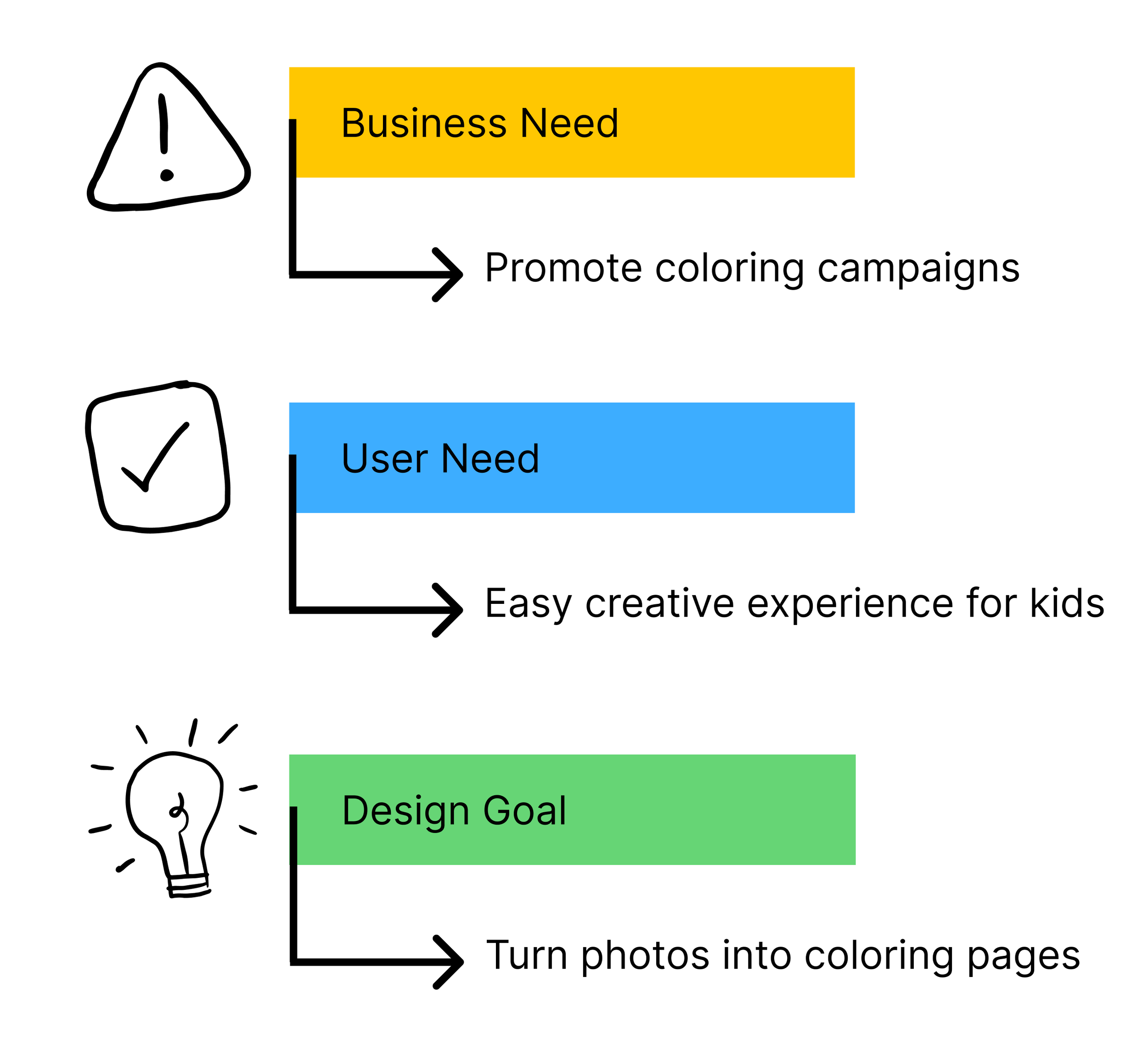
Crayola wanted to extend engagement beyond physical coloring books into digital experiences.
The initial brief was intentionally open-ended:
“Create a digital companion for future coloring campaigns.”
Before designing solutions, we needed to resolve a deeper ambiguity:
Is this a one-off campaign tool?
Or a reusable creative platform?
What actually makes digital creativity meaningful for children?
Research Approach
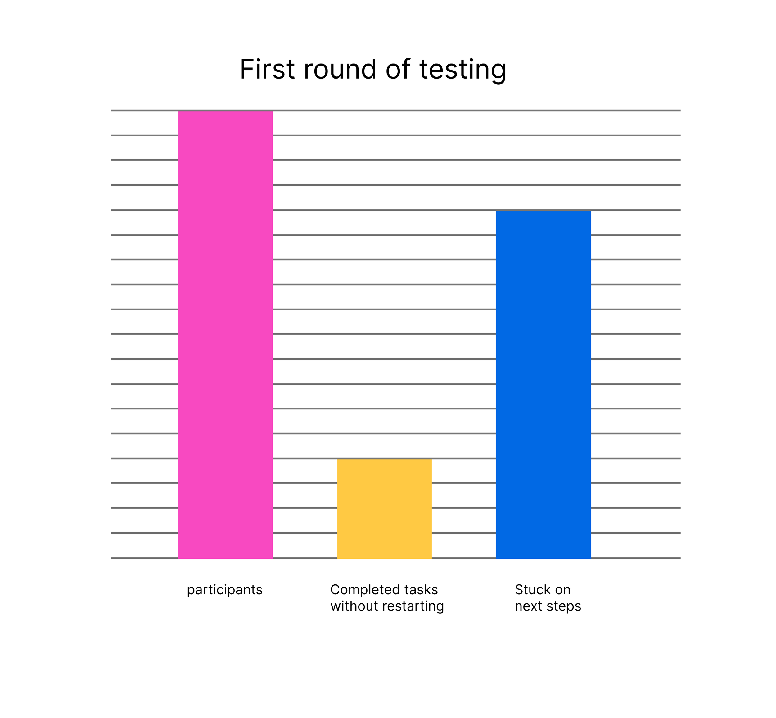
We began with caregiver-first usability testing, since caregivers controlled discovery, download, and first use. Testers were given a list of instructions and questions that they explored while recording themselves
Method:
25+ usability sessions.
Task-based prototype testing
Video observation + notes
Why caregivers first mattered
Children determine engagement.
Caregivers determine whether engagement ever happens.
So caregiver comprehension became a gate condition for product success, not a secondary concern.
Key Insight
If caregivers don’t immediately understand the value, children never experience the product.
This reframed the problem from “designing a fun creative tool” to:
Designing a system that communicates value instantly to adults while remaining simple for children.
Key Findings & Design Decisions
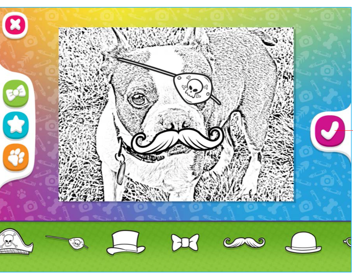

1. Disconnected controls reduced creative confidence
What we observed
Users could place stickers successfully but struggled to understand how to modify them or change sticker options afterward. Many assumed editing was possible once leaving the customization screen.
Why this mattered
Caregivers interpreted check button as part of the sticker selection when it actually moved them out of the customization screen. This caused frustration since testers would have to start over. It also limited their exploration and creative ownership.
Design decision
Added a module so testers knew there is no way to edit after going to the next step.
Moving UI and connecting menus to stickers helped bring more visibility to tools.
Tradeoff
Increased clarity and discoverability
Increased visual UI density
Reduced minimal aesthetic purity
Outcome
Higher confidence in creative manipulation and increased experimentation.
25+ Caregivers Tested
Children ranging in age from
3–8 years

2. Users lacked a sense of completion
What we observed
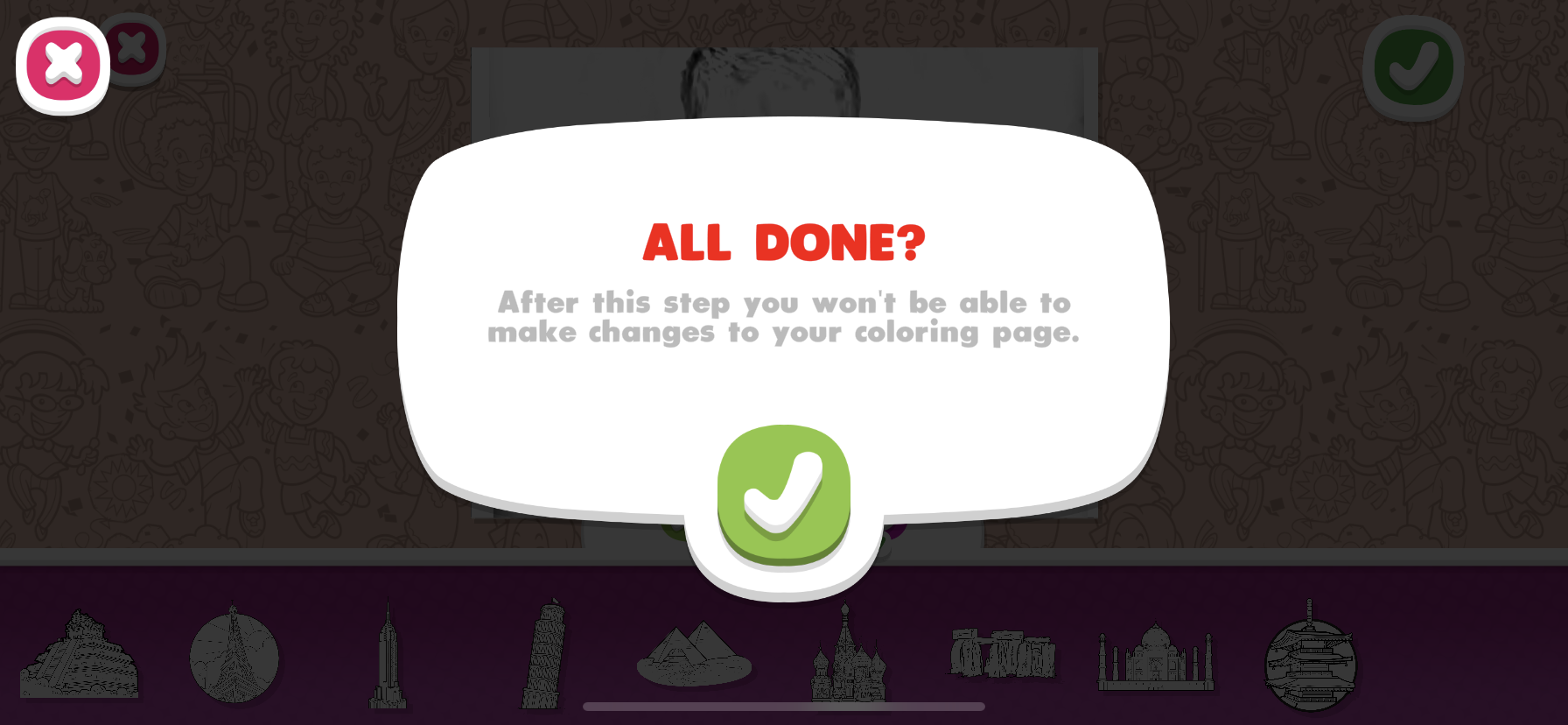
Participants frequently hesitated at the end of the workflow and were unsure if their artwork was “finished” or saved.
Why this mattered
Uncertainty at completion reduced confidence in sharing or printing output—even when the workflow was successful. Also introduce frustration as participants would have to redo the work if they ended the session before they were ready.
Design decision
We introduced explicit completion states and confirmation moments throughout the flow.
Tradeoff
Increased clarity and closure
Added an additional system state
Slightly longer perceived workflow
Outcome
Reduced hesitation and increased confidence in completing creative work.
3. Caregiver confidence determined adoption
What we observed
Caregivers who quickly understood the product value were significantly more likely to:
complete onboarding
introduce it to children
express intent to reuse
Why this mattered
Caregivers were not just users—they were gatekeepers of adoption
Design decision
We prioritized early value communication over feature depth by introducing a first time user walkthrough.
Tradeoff
Faster comprehension and trust
Reduced early feature explanation
Less onboarding depth upfront
Outcome
Improved adoption likelihood and reduced first-use friction.
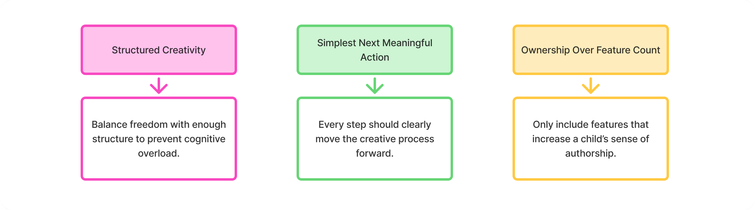
Experience Design Principles
Experience Flow
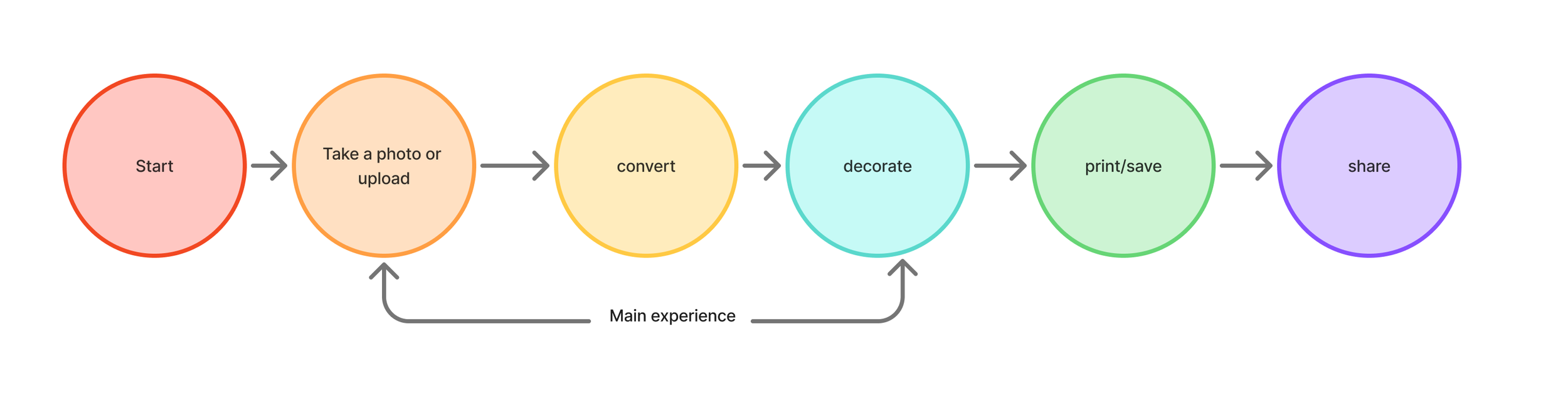
This workflow became the foundation for both the MVP and future Crayola extensions.
Prototype & Validation
Original prototype
Prototypes were used not only for validation, but also for decision alignment across stakeholders.
They helped:
surface usability issues early
test assumptions about adoption
align marketing and product vision
support retail conversations
Key constraint decision
We deliberately kept prototypes “campaign-simple” early on, even though we knew the platform could expand.
This prevented premature complexity and ensured we validated behavior before scalability.
Platform Scaling

After launch, the system expanded into Colors of the World.
Because core interactions were intentionally constrained and structured, we were able to:
reuse workflow patterns
extend creative components
adapt content without redesigning interaction logic
Key outcome
The system proved it could scale without increasing user complexity.
Impact
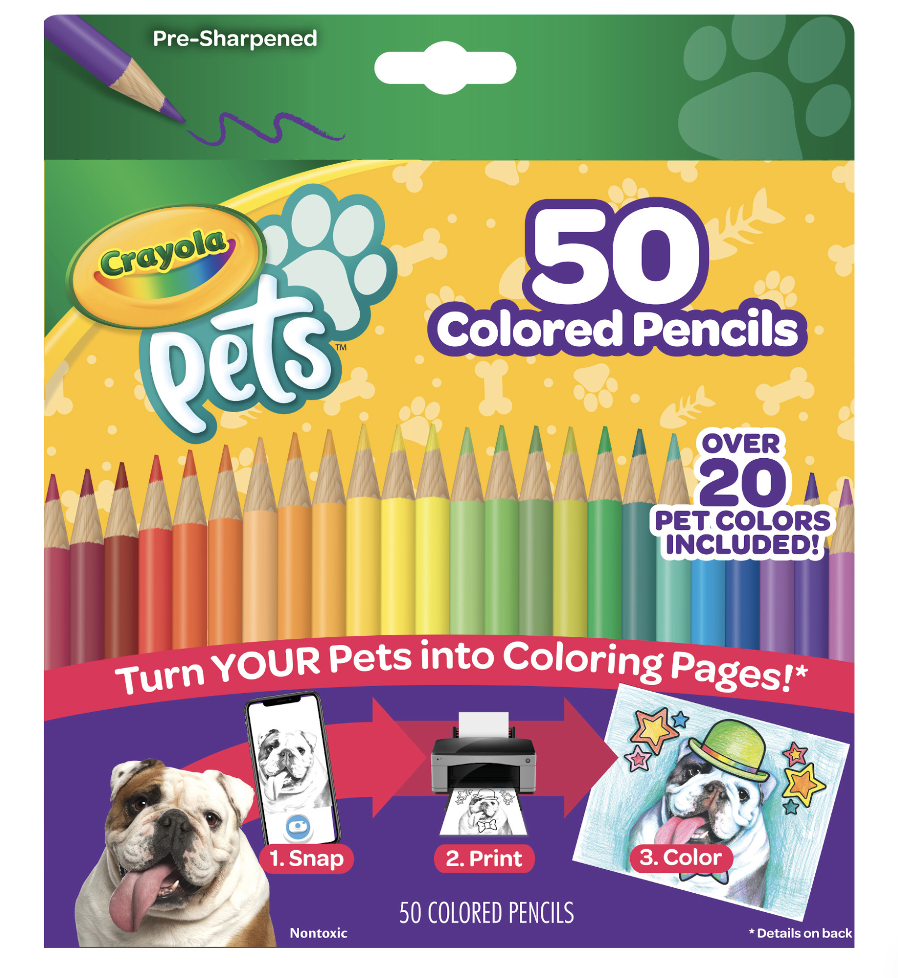
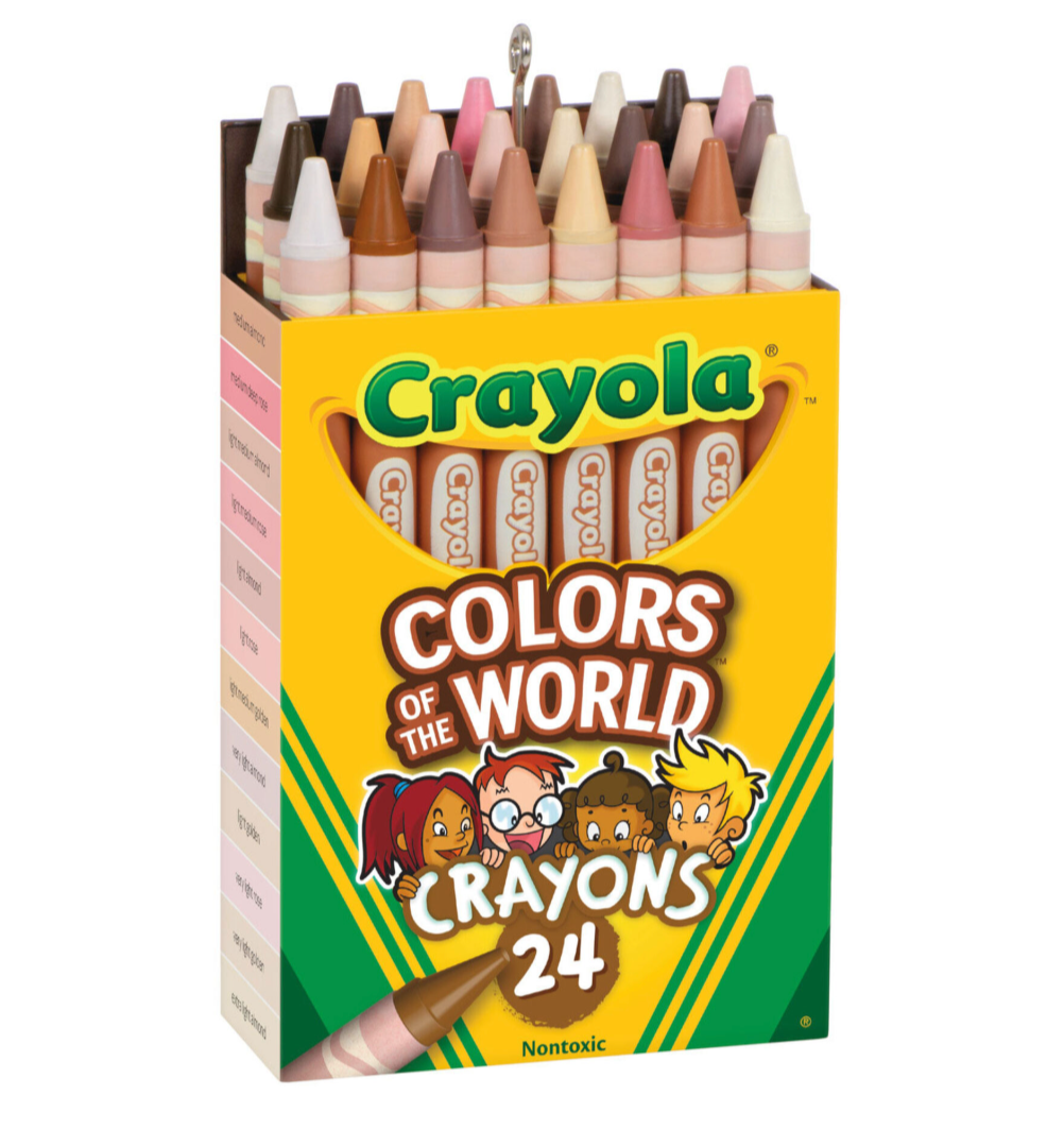
Business Impact
Supported a $5M retail partnership opportunity
Enabled Crayola’s first internally developed mobile app launch
Product Impact
Evolved from campaign concept → reusable creative platform
Established foundation for future initiatives
User Impact
Reduced creative friction
Increased discoverability of editing tools
Strengthened sense of ownership over output
Reflection
This project reinforced a key principle:
Designing for children requires designing for caregivers simultaneously.
Critical learning
The success of the product depended not just on usability, but on trust and comprehension at the point of introduction.
Children shaped engagement.
Caregivers shaped access.
Both had to succeed for the system to work.
What I Would Improve Today
Introduce earlier child testing to capture behavioral nuance sooner
Add instrumentation for longitudinal engagement tracking
Measure emotional response alongside usability outcomes.
Final Insight
The most successful creative systems are not defined by features—they are defined by ownership.
This project succeeded because we shifted from delivering content to enabling creation.